
 By Sameeha Faiz - August 26, 2025
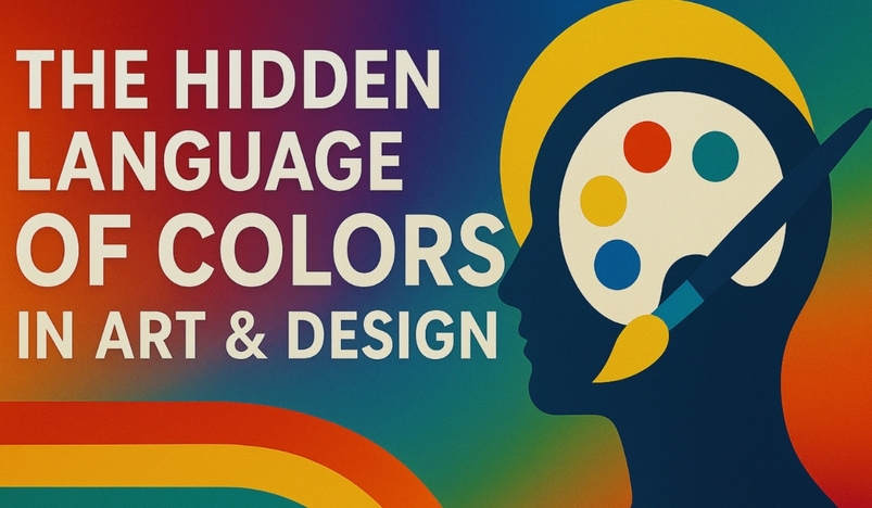
Colors speak.
They shape feelings.
They guide our choices.
In art and design, color is more than decoration. It is communication.
Every shade tells a story. Red can spark energy. Blue can calm the mind. Yellow can brighten a mood. Designers and artists use these shades to connect with emotions. They know colors can whisper or shout. They can comfort or excite.
Think about a logo. Why is Coca-Cola red? Because red creates urgency and joy. Why is Facebook blue? Because blue feels calm and trustworthy. These choices are not random. They are strategic. They show how design and psychology blend.
In painting, colors guide the eye. Dark tones create depth. Light tones create focus. Warm tones feel inviting. Cool tones feel distant. An artist controls this balance to shape the viewer’s experience.
In interior design, colors change how we live. A soft beige wall feels safe. A bold green kitchen feels fresh. A pastel bedroom feels calm. Without words, colors set the mood.
Digital design follows the same rules. Websites with clean, muted tones feel elegant. Bright neon palettes feel bold and modern. Even small changes in color can transform the message.
The hidden language of colors is powerful. Once you understand it, you see it everywhere. On posters. On products. On clothes. On screens. It shapes your feelings before you even notice.
Art and design are not only about form. They are about color. They are about how colors speak to the human heart.
_07-13-2026_01-13.jpg)


.jpg)
.jpg)
_20-08-2026_05-08.jpg)
_27-51-2026_11-51.png)
_27-43-2026_12-43.png)
_03-27-2026_08-27.jpg)


.jpg)
.jpg)


.jpg)


.jpg)
.png)
.jpg)


Leave a comment